Design Systems
Carousel Component Alignment
Scroll ↓
Intro
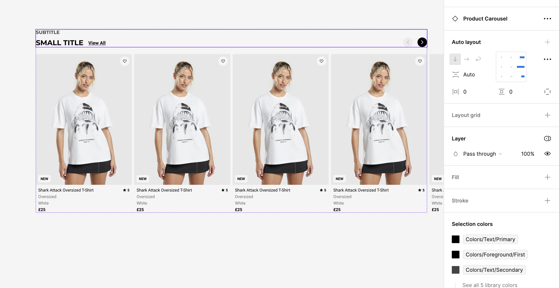
We identified the need to standardise carousel components across our digital products. This involved creating a unified carousel design using existing contributions that enhanced usability, aesthetics, and performance while ensuring consistency and adaptability.
Initial Phases
Research and Exploration:
Conducted usability testing and user surveys to gather feedback on existing carousel implementations.
Analysed competitors' designs and industry standards to identify best practices.
Collaborated with content, engineering & design teams to understand the various use cases and requirements for carousels across different products.
Collaboration:
Worked within contribution models, inviting feedback and contributions from the design and development teams throughout the design process.
Facilitated design reviews and iteration sessions to refine the component based on team and stakeholder feedback.
Integrated the carousel component into sprint teams' workflows, ensuring smooth adoption and consistent implementation across projects.
Design Process:
Audited existing use cases
Developed a single, versatile carousel component with multiple variations (image carousels, content carousels, testimonial carousels) to meet diverse needs.
Prototyping: Built interactive prototypes to showcase carousel interactions and transitions, helping developers understand the intended behavior. Also applied Smart Animate for smooth transitions between carousel states, enhancing the user experience in prototypes and easing the developer hand-over.
Development and Handover:
Partnered with developers to implement the carousel component using React, Swift UI & Compose, ensuring consistency in ui through correct use of tokens.
Created detailed documentation, including usage guidelines, interaction states, and accessibility considerations.
Defining Goals & Objectives
Increased Usability: The process led to a reduction in time spent searching for and understanding component usage guidelines, significantly improving team efficiency across both design and development.
Increased Revenue: By streamlining the design we contributed to an increase in click through rate, directly impacting Gymshark’s revenue.
Increased Consistency: Enhanced the visual consistency of the component by standardising the layout and presentation of information. And by documenting the mechanics, including interaction states, and addressing edge cases and off-pattern components by including specific guidelines for documenting these scenarios.
Alignment Process
From the initial concept through implementation to documentation and rollout. We demonstrated that we could increase consistency, clean our code base and speed up our releases by creating a re-usable carousel component.
-
Shared initial designs with the design team and stakeholders for feedback, using Figma’s comment feature for real-time collaboration and out bi-weekly DS Triage meeting
Iterated on the design based on feedback, focusing on improving aesthetics, usability, and functionality.
-
Created detailed documentation within Figma, outlining the carousel component’s usage, variations, and best practices.
Published the carousel component to Figma’s team library, ensuring consistent usage across all products.
-
Partnered with developers to build the carousel component, conducting regular tests to ensure it met design specs and performance criteria.
-
Facilitated training sessions for the design and content teams to ensure smooth adoption and effective implementation.
Briefed in follow up usability testing with real users to validate the enhancements and gather feedback.
Tools used on the daily
Figma Variants
Created multiple carousel variations for different content types and interaction patterns using Figma’s variants feature.
Auto-Layout
Making sure carousels were responsive to content changes and adaptable to different screen sizes.
Interactive Prototyping & Smart Animate
Built interactive prototypes to showcase carousel interactions and transitions, helping developers understand the intended behavior.
Collaboration and Handoff:
Provided developers with design specifications, CSS properties, and interaction details directly in Figma.
Leveraged Figma’s comment feature for real-time feedback and iteration.
EightShapes
Created detailed documentation within Figma, outlining carousel component usage, variations, and best practices.
Libraires
Published the enhanced carousel component to Figma’s team libraries, ensuring consistent usage across all products and managed the depcrecation of the old carousel component


