Product Design
Implementing Gymsharks first design system
Scroll ↓
Intro
As a seasoned designer, I undertook the challenge of implementing a Unified Design System with a single source of truth across web, iOS, and Android mobile applications at Gymshark. This ongoing project aims to enhance consistency, efficiency, and collaboration within our design and development teams.
Key Acheivments
Established Pattern Libraries
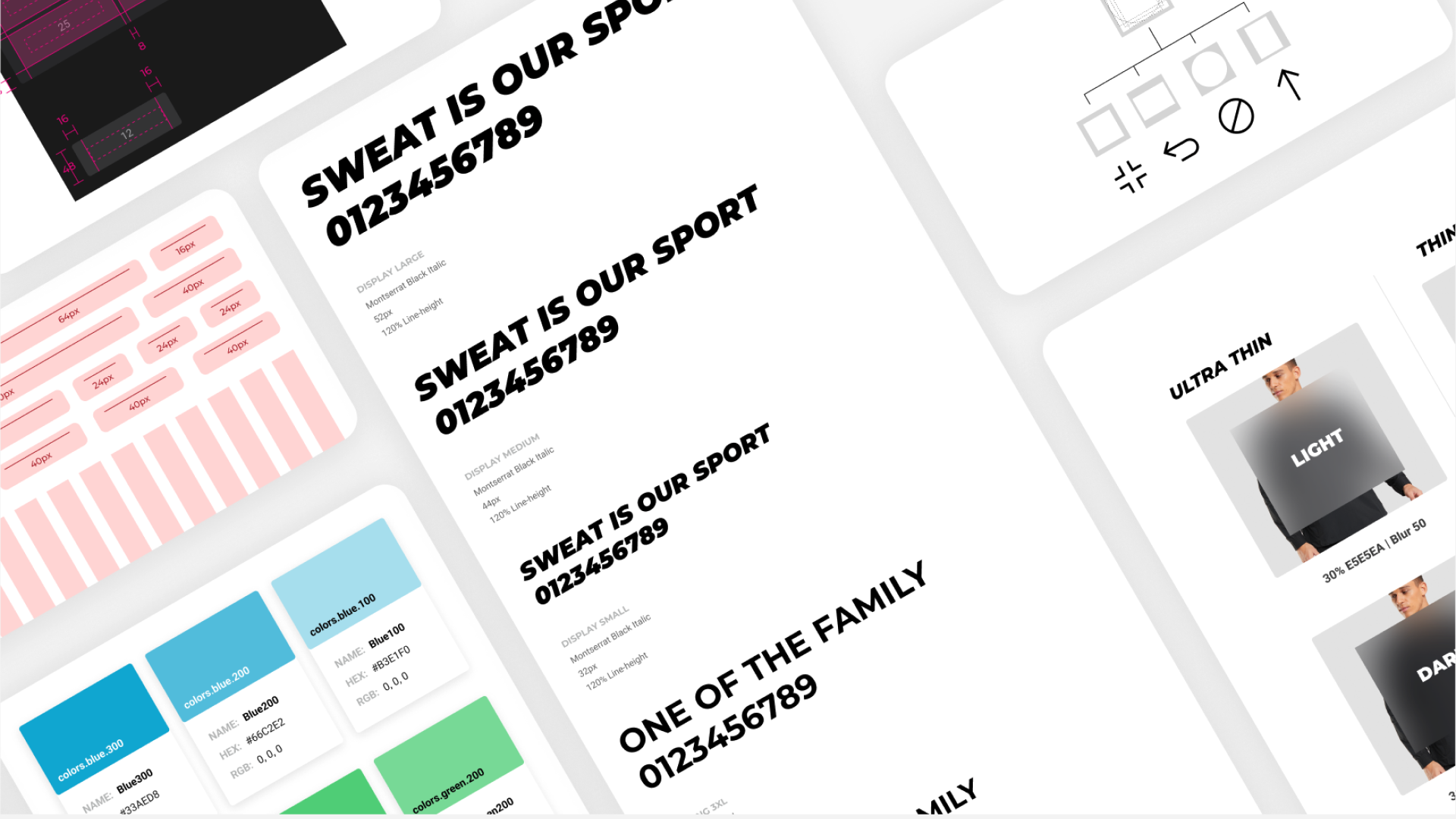
Developed comprehensive pattern libraries that serve as the foundation for design elements across platforms. This ensured consistency in UI components, typography, color schemes, and interactions.
Documentation & Guidelines
Created comprehensive documentation and guidelines for designers, developers, content authors, Business Analysts, and Product Owners. Thus ensured clarity in usage, behavior, and implementation of design components.
Aligned design across products
Implemented a cohesive design language that aligns seamlessly across web, iOS, and mobile applications. Acheived through rigorous audits & component refinement, it ensured a unified brand experience for users across various touchpoints.
Developer Integration
Initiated a seamless designer-developer handover process for efficient implementation of design components. Collaborated closely with the development team to integrate design assets seamlessly into the coding process.
Designer Workflow optimisation
Streamlined workflows for designers to contribute updates and new components to the design system. Implemented a collaborative platform for real-time feedback and version control.
Initial Phases
Educate Stakeholders
We started by educating key stakeholders, including executives, managers, and team members, about the benefits and importance of a design system.
Clearly explained how a design system can improve efficiency, consistency, and user experience across all products and services.
Developed Documentation and Guidelines
Created a document format to document design system components, patterns, and guidelines comprehensively, based on our stakeholders. Made sure the documentation was easily accessible.
Build a Business Case
Developed a comprehensive business case that outlined the potential ROI, time savings, and improved user satisfaction that a design system can bring. As well as help reduces development time, minimise design debt, and enhance brand consistency.
Promoted Collaboration
Tried to foster a culture of collaboration between design, development, and other teams by encouraging open communication and the sharing of insights and improvements.
Established Goals & Objectives
Defined clear goals and objectives for implementing our design system. These aligned with the company's overall business strategy and user experience objectives. 3 stages we set. Short, Medium & Long.
Discovery & Asessment
Audit
It involved a comprehensive review of the existing visual language and design assets used by the company, with the aim of identifying inconsistencies and areas for improvement.
I was able to develop a clear understanding of the company's visual language and create a roadmap for the design system's future development. The audit phase is essential for creating a successful design system that accurately reflects the company's brand identity and provides a seamless experience for users across all platforms.
Stakeholder meetings
We conducted meetings with key stakeholders from design, development, and product management to understand their pain points, expectations, and requirements.
Defining Goals & Objectives
During this phase, I worked closely with key stakeholders to establish a clear understanding of the company's goals and objectives. This involved creating a road map for aligning & developing a comprehensive style guide that outlined the design principles and guidelines for the project. By collaborating closely with my design and product teams, we were able to establish a roadmap for the design system's development, outlining key milestones and deliverables that would guide the project's progress.
Implementing & Documenting the Design System UI Pattern Libraries
This involves translating the design principles and guidelines into actual components that can be used firstly by designers and then developers to create consistent designs across all platforms. During this phase, I created a library of components, including typography, color palettes, icons, and UI patterns, that could be easily accessed and used across the company's design workflow.
Each component was carefully documented with clear guidelines for usage, interaction, and behavior. This ensured that designers and developers had a clear understanding of how to use each component, and helped to maintain consistency across all designs.
Additionally, I created a system for version control and maintenance to ensure that components could be updated and improved over time as the design system evolved. By implementing and documenting components, I was able to create a comprehensive design system that was easy to use and provided a seamless experience for users across all platforms.


