Product Design
Updating Gymsarks product listing pages & filter system
Scroll ↓
Overview
Revamping the product listing page and filter system to enhance user experience and boost conversion rates.
Project Brief
Company: Gymshark
Objective: Users who filter are more likely to add to cart vs those who don't. We want to improve the experience of filtering and encourage more users to filter their results.
Timeline: January 2023 - June 2023
Problem Definition:
User Research Insights:
Users found the existing product listing underwhelming, with filters being hard to find, leading to high bounce rates.
Size and Sort filters were identified as the most crucial for users, but their placement was not optimised.
When launching a new range, users couldn't filter products by pattern, gender, product type, and many other options from collection pages.
Data Analysis:
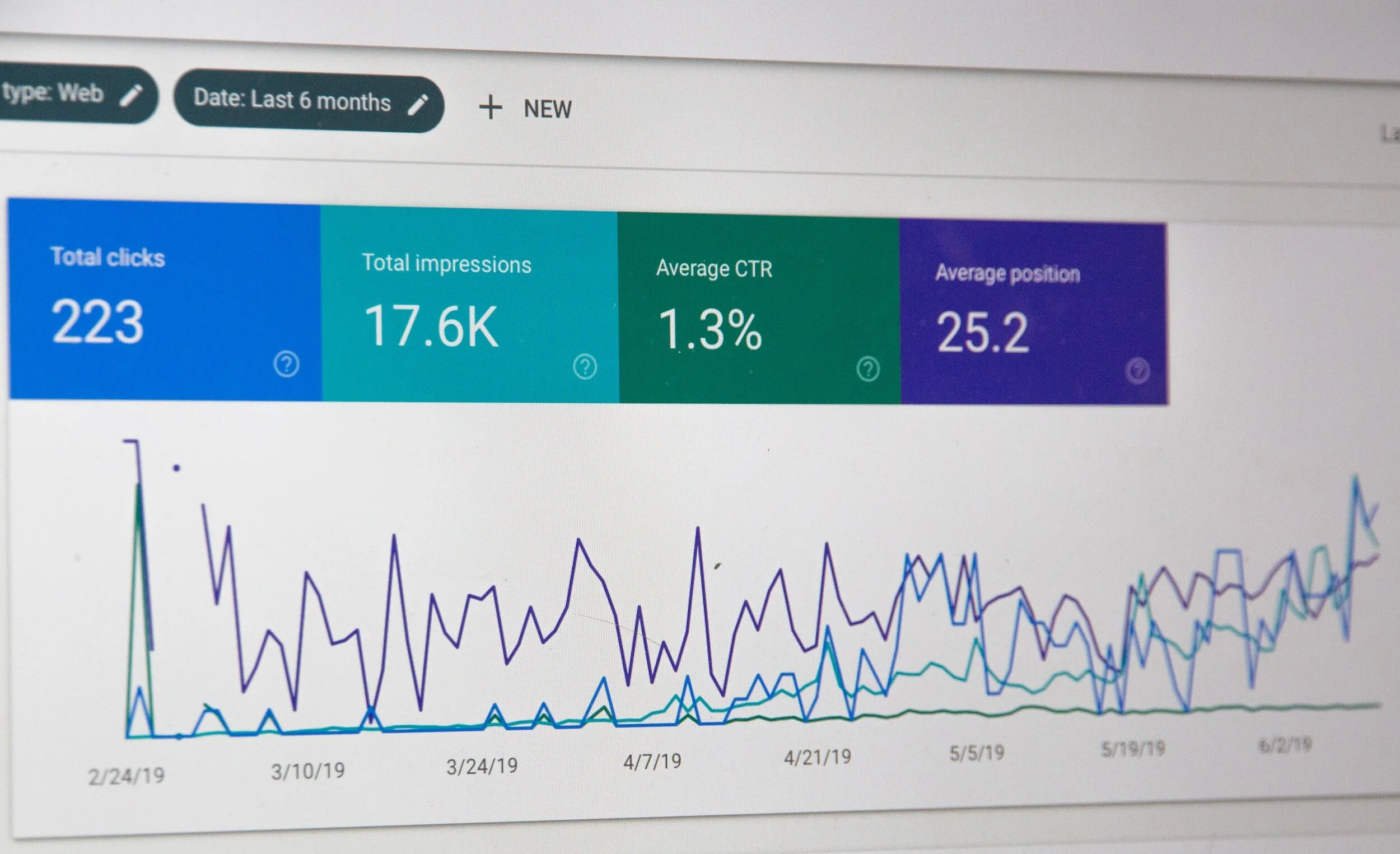
Every 3 in 5 users go to the PLP. The majority land there directly whilst another large proportion come from the home page. High bounce rates and drop-offs were observed on the existing product listing page.
Analysing user interactions revealed a significant preference for Size and Sort filters.
Design Process
Ideation
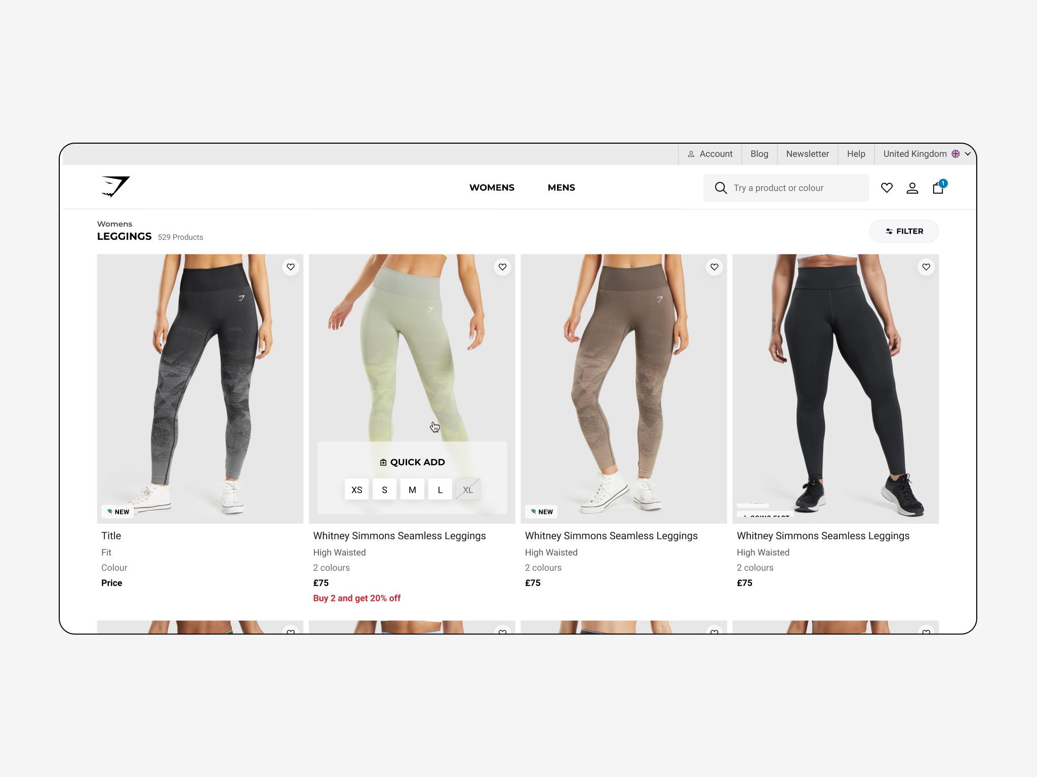
We held a brainstorming session focused on improving the visual appeal of product cards, making the filters more discoverable. We also gave considerations around the order of filter, giving Size and Sort more prominence.
Wireframe & LoFi protos
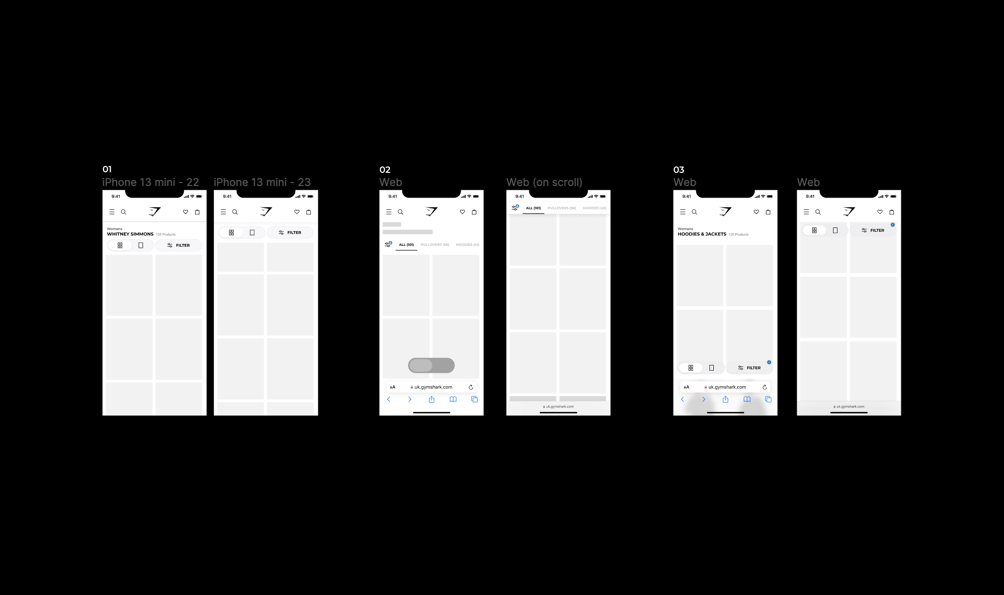
Wireframes were created incorporating some versions of redesigned product cards that had different levels of information on them. A second set of wireframes was created for the filter placement within the PLP. We also had a final set of wireframes that focussed on the filter order so we could determine the optimal placement for the Size & Sort filters.
User testing
A/B testing showcased an increase in engagement with filter buttons that were at the top of the page on load and were sticky in behavior. Users also reported that the Sort filter categories. Could have been better. We checked the data around current usage which showed that Price: High to Low was the most used. This prompted us to re-order the sort list view.
Visual Design
-
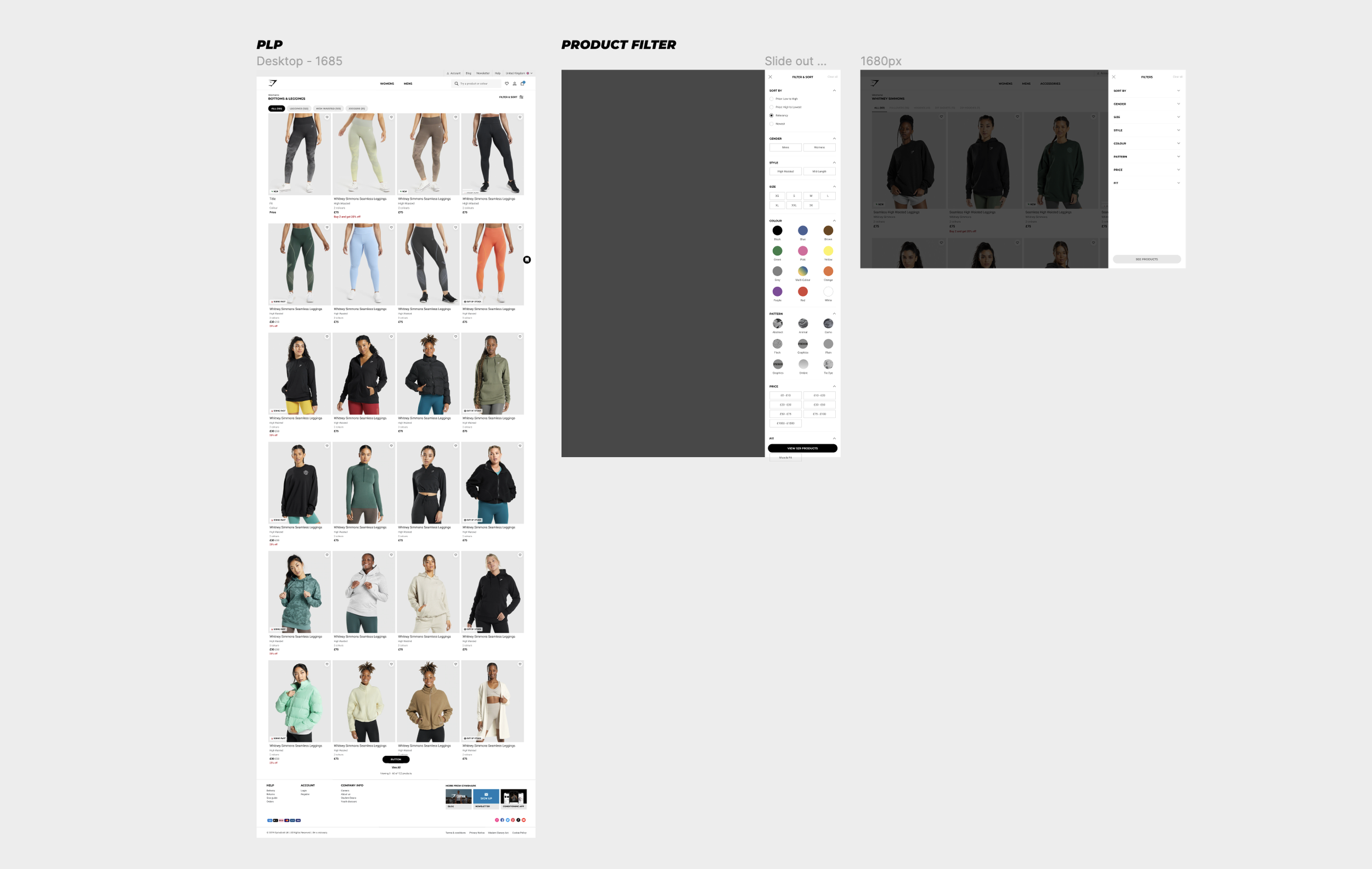
PLP UI & FIlter discovery
We removed the image header due to no inc. in conversion
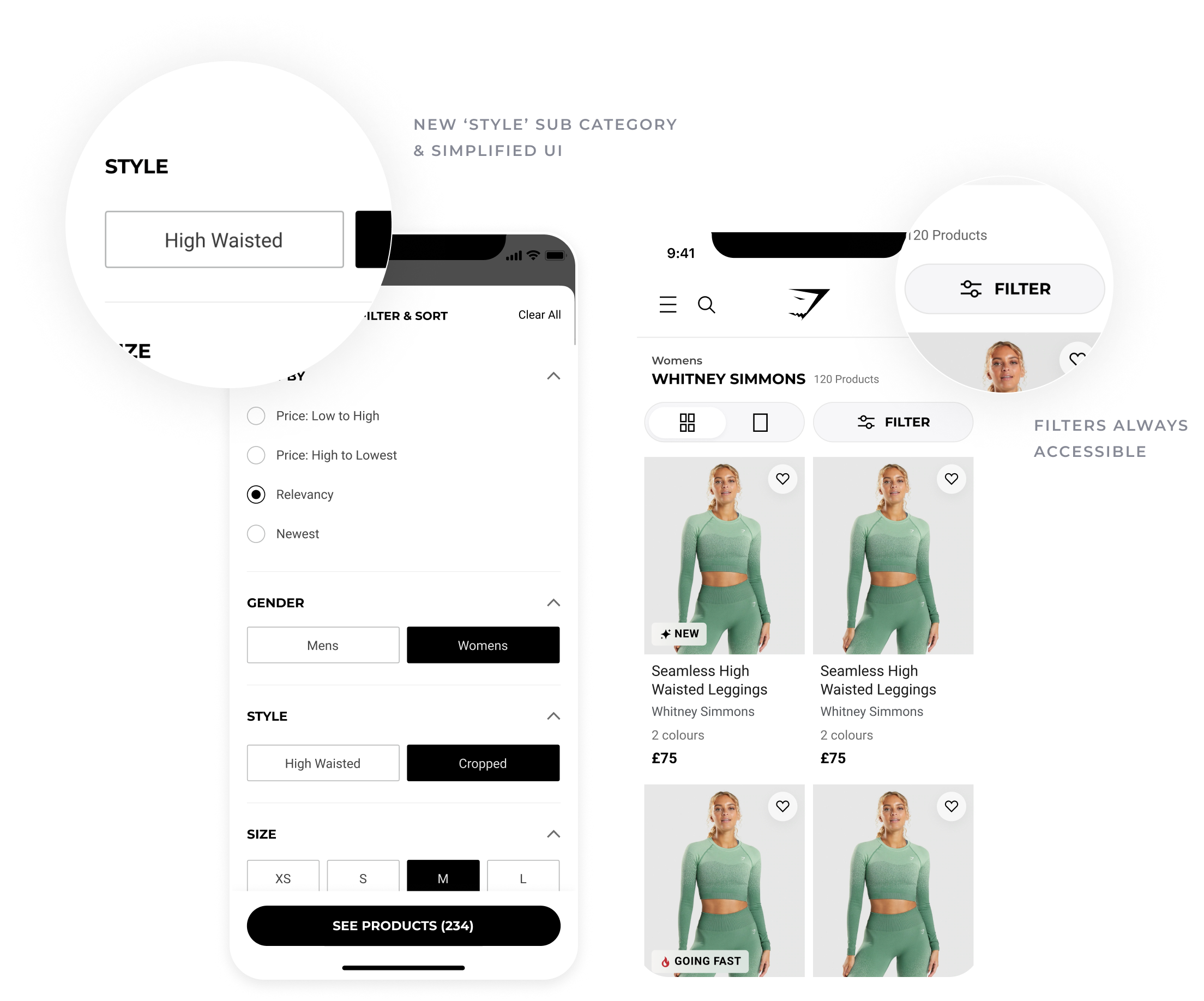
Reduced the page title so that the Product filled the view more on first load. This in turn pushed the filter button to the top of the page and made it more discoverable.
We moved the Filter tray so it opened from the side on desktop & from the bottom on mobile. cleaning the PLP and focusing the user on the choices they are making
-

Filter UI
We simplified the list UI, making it easier for the customer to make a choice. And access to filters is always on the screen via a sticky button.
A Full-screen modal on mobile allows the user to focus on their choices. We aligned Sort By UI on all products to behave in the same way
The introduction of sub-categories into the filter from the page allowed for better refinement and we rearranged our filters based on UXR insights
-

Everything was tested
The new filter system suggested an increase in conversion rates would be achieved when put in front of user groups. This was because the new experience was helping users find the specific products they needed, quicker. This eluded to the hypothesis that people who filter add to bag more.
Implementation
We then collaborated with developers to ensure smooth implementation of the redesigned PLP and filter system.
Post-launch, we observed a reduction in page load time, positively impacting user retention , due to our move to a headless framework of the page. We also found that users spent more time on the product listing page.
Results
Key Metrics:
After filtering, and against data for users who don't filter:
PLP to PDP click-through rate increased
PLP to PDP to Add to Cart conversion increased
PLP to Checkout conversion increased.




Lessons learned
Challenges
Being able to produce prototypes with real behaviour at the time was difficult. Now that Figma has more intuitive prototyping techniques such as conditionals, it would be a little easier. Alternatively, I think I could use something like WebFlow to get exactly the right micro-interactions I was looking for, for the sake of testing.
Future iterations
In the ideation session, we explored personalised filtering options based on user preferences. As well as this we toyed with the idea to implement dynamic sorting algorithms to further enhance user experience that could have been based on purchase history.

