Product Design
Gymshark 66
Scroll ↓
Overview
An annual campaign to challenge change within their community
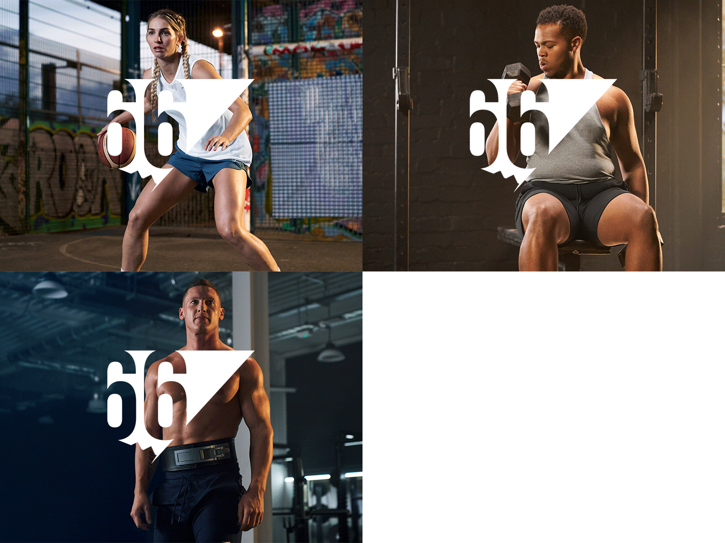
2022 was the year to get involved. This event wasn’t just about fitness challenges and physical changes.
Project Brief
Company: Gymshark
Objective: To create an experience that is both informative and inspiring. To offer everything our community needed to get started on their fitness journey, including details about the challenges, workouts, and wellness tips.
Project Goals
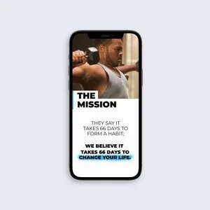
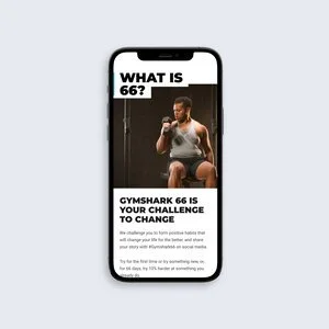
Gymshark 66 is the ultimate challenge to change. They say it takes 66 days to form a habit. And they asked you to commit to any 3 goals over that period. Our goals for the project were…
Deliver an experience that matched the Branding
Increase E-mail sign-ups by the end of the campaign
Deliver campaign instructions clearly & accurately
Research
With our KPIs defined, I looked for inspiration across the internet. Finding examples of clear & consistent branding, use of obvious CTAs with clear wording and most importantly campaign sites that told a story at the highest standards. Awwwards gave great examples of all 3 requirements and was the main source of inspiration.
Lo fid → Hi fid → Protyping
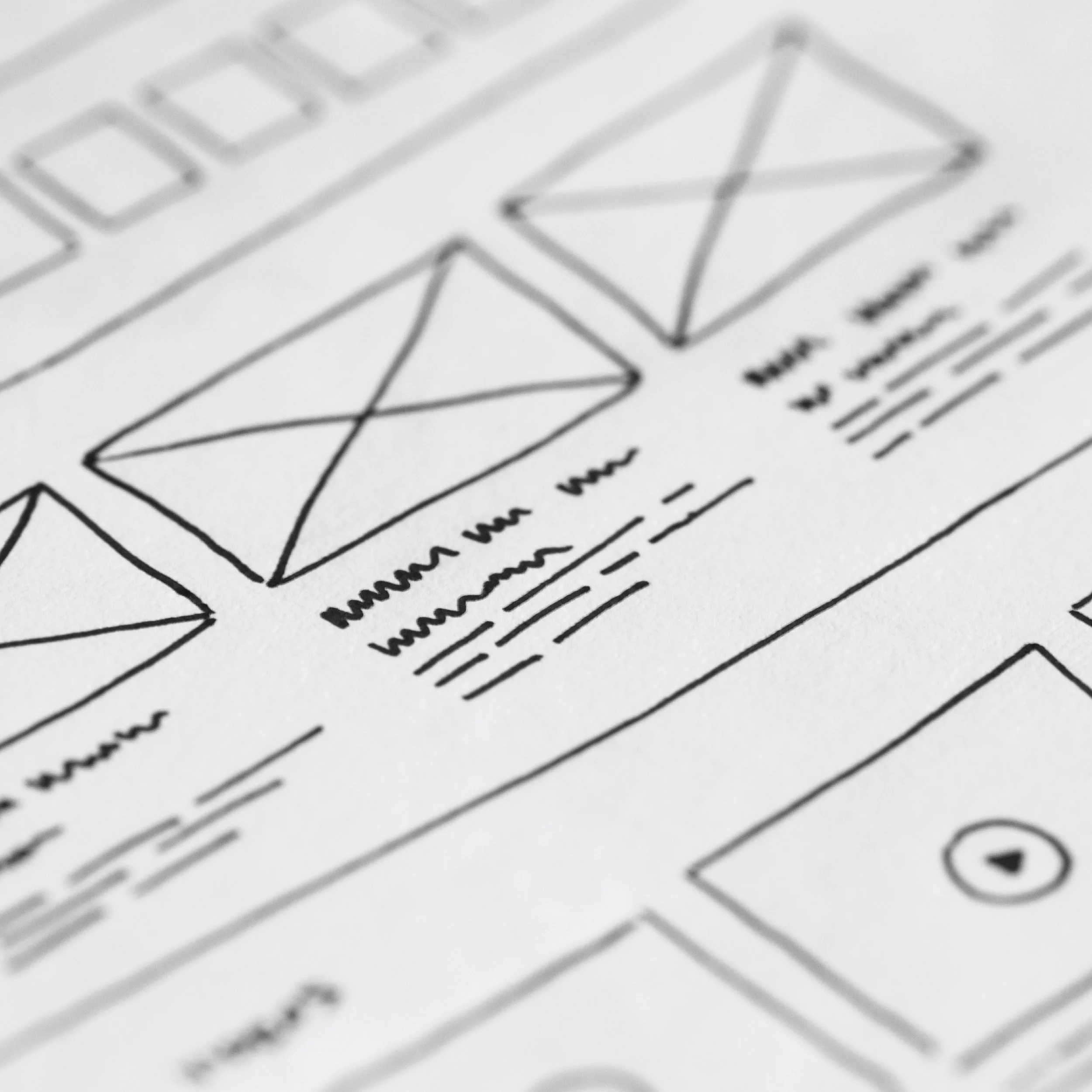
To plan out the experience, I wireframed each page to help understand the information hierarchy and overall flow of the site. Imagery and basic copy were then introduced to bring the design to life. Different concepts were created for each section with the best chosen in critique sessions with peers.
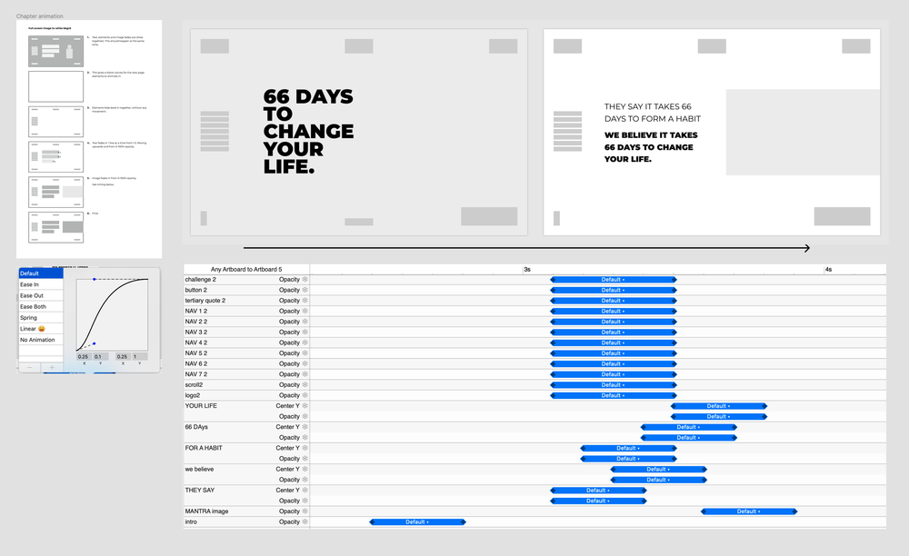
With a design direction multiple device views were explored making sure the design looked its best throughout. This stage was important as over 90% of our traffic was mobile-led. To finish this stage off, the motion & animation timings were defined in order to create an experience that met our high standards.
Testing
Hi-res prototypes were handed to the UXR team in order to make sure that there were no issues within the experience.
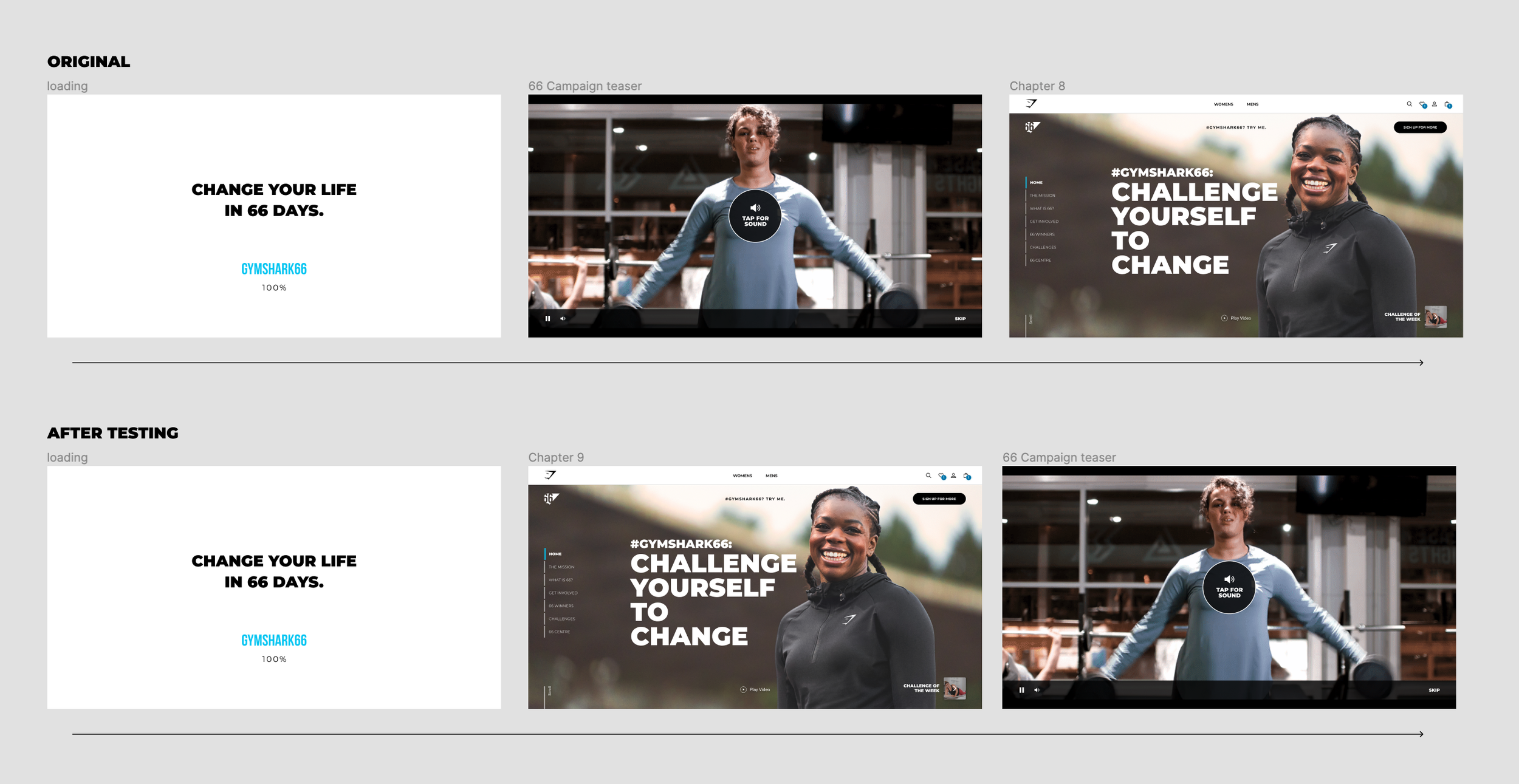
Something that was highlighted was around the auto-play video. The intention was to be able to play a video that explained the campaign to the user before they entered the site that would confirm what they had just seen in the video. UXR revealed that there was an issue where users would watch the video and then leave the site, which was affecting the email sign-up rate KPI.
Changing the flow so that the video was available, but after the user had entered the site, balanced the needed education piece and email sign-up KPIs that allowed us to do both.
The Result
Large Brand Contribution
〰️
100k+ Sign Ups
〰️
High User Interaction
〰️
Large Brand Contribution 〰️ 100k+ Sign Ups 〰️ High User Interaction 〰️
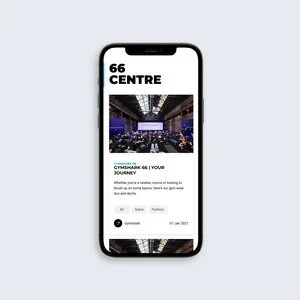
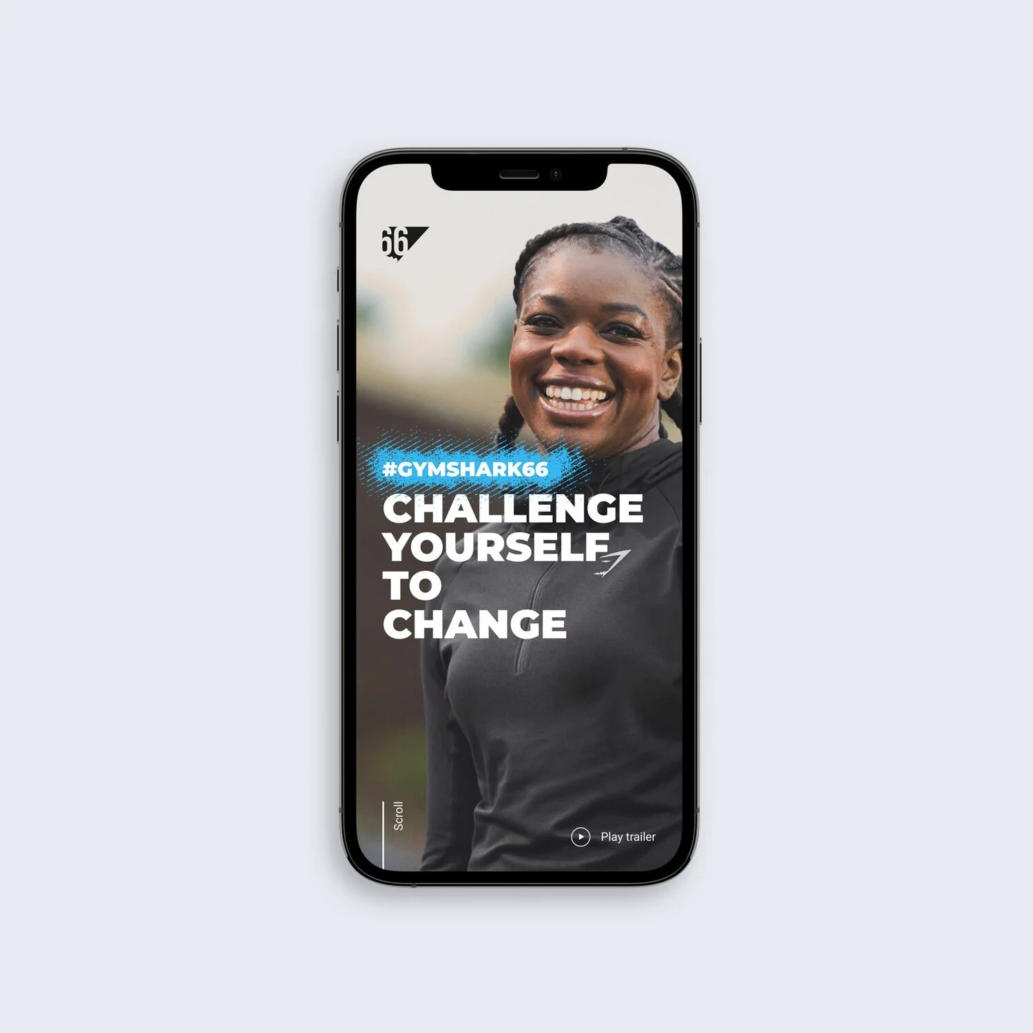
The result was a highly visual micro site, that was on brand and matched the style of the campaign.
With a sleek design and user-friendly interface, you can easily navigate through the content and find what you need. I also incorporated visually engaging graphics and images to help motivate and inspire.
Lessons Learned
The campaign retro told us that this was one of the most successful campaigns for sign ups that Gymshark have had and user feedback confirmed that the information given on the site as well as on social media was clear and easily digested.
All in all this was a successful campaign and very enjoyable to work on.

